If you’ve been to Walmart recently, then you might have noticed some changes happening at your local store. Updates have been rolling out slowly across the country, and the retail titan is only just beginning to make changes, according to a recent announcement.
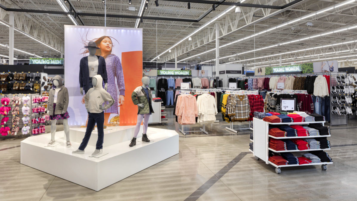
Walmart just opened a new section called Time Well Spent at a store in Springdale, Arkansas, that the company hopes will resonate with its customers nationwide. The mission, according to company executives, is to create interactive browsing experiences that “wow” customers through stunning visual displays that use a combination of new products and fresh tech.

In an announcement about the redesign, Walmart’s vice president of marketing—store design, innovation, and experience, Alvis Washington, wrote that customers still want to “touch, feel and try” things before they buy.
“So, we’re now aiming to make customers feel wowed and proud when they shop with us,” Washington wrote. “We’re using powerful design elements to show off amazing products that wow our customers, and when they see the value, they are proud of their choice and purchase.”

In September 2020, Walmart announced the first phase of overhauling its store design, with updates planned for signage and more integration inside the store with the Walmart app. Improved navigation layout and design were also a highlight of the first phase remodeling efforts, along with contactless checkout and payment.
So far, these elements have been implemented in nearly 1,000 stores, according to the announcement. The company currently has more than 5,300 stores across America, meaning you aren’t alone if you haven’t seen any updates yet in your area.

How is Walmart planning to further maximize the shopping experience for its customers? The announcement highlighted a number of elements the retailer is experimenting with at the new Time Well Spent section in Arkansas, including:
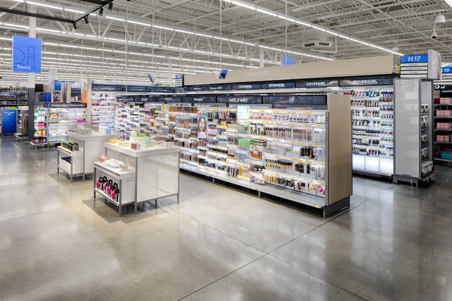
- New lighting aimed at making stores brighter and more inviting. See the photo of the new makeup display above for an example.
- Enhancing store layout to maximize the use of space to have foot traffic flow better and help customers find products easier.
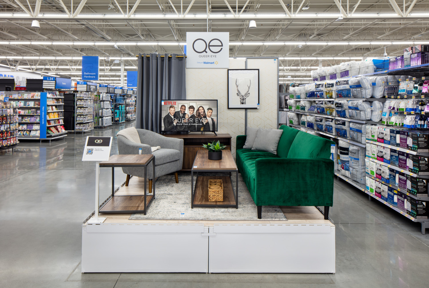
- Adding dynamic displays around stores, including video displays, placing products as customers would use them at home (a la Ikea’s room displays).
- Creating a “store-within-a-store experience,” with national brands of clothing, baby products and beauty products being featured prominently with display items available to touch and try. Gap is one brand that’s featured heavily in Walmart’s press materials on the new layouts, for instance.
- Including QR codes on products so customers can get more information about them before buying. Or, they can discover other items that might go well with that particular product.

If the test design resonates with customers in Arkansas, the company will look to expand various design elements into other locations around the country. In a world where shopping from home is increasingly becoming the norm, it seems the brand is trying to give people an incentive to drop by its many stores and browse the old-fashioned way.
This story originally appeared on Simplemost. Checkout Simplemost for additional stories.


